Our logo is influenced by Jawi, a script that originated in the 14th century in the wider Malay world. Though Jawi has been replaced by the Latin alphabet in most parts of Malaysia and Indonesia, one does occasionally see it, for instance on some road signs, alongside the Latin spelling.
Why did we seek inspiration from Jawi? It’s simply a celebration of something indigenous to our region.
Jom worked with Practice Theory (PT), a Singaporean design agency whose work we like.
PT’s two early logo designs had some fans but also quite a few detractors within our focus group.
The more popular of the two designs had a strong Western calligraphy influence, perhaps suitable for an American or British publication. Dissenters argued that an Asian publication shouldn’t be adopting a Western aesthetic.
Fair enough. We started looking into traditional Asian scripts.
PT consulted Wei Jin Darryl Lim, a Singaporean postdoctoral researcher specialising in the history of Malay printing, and Malay books printed in the 19th century.
Darryl suggested looking at a particular style of Jawi referred to as the ‘19th century Straits scribal hand’, which was characteristic to Singapore and the region.
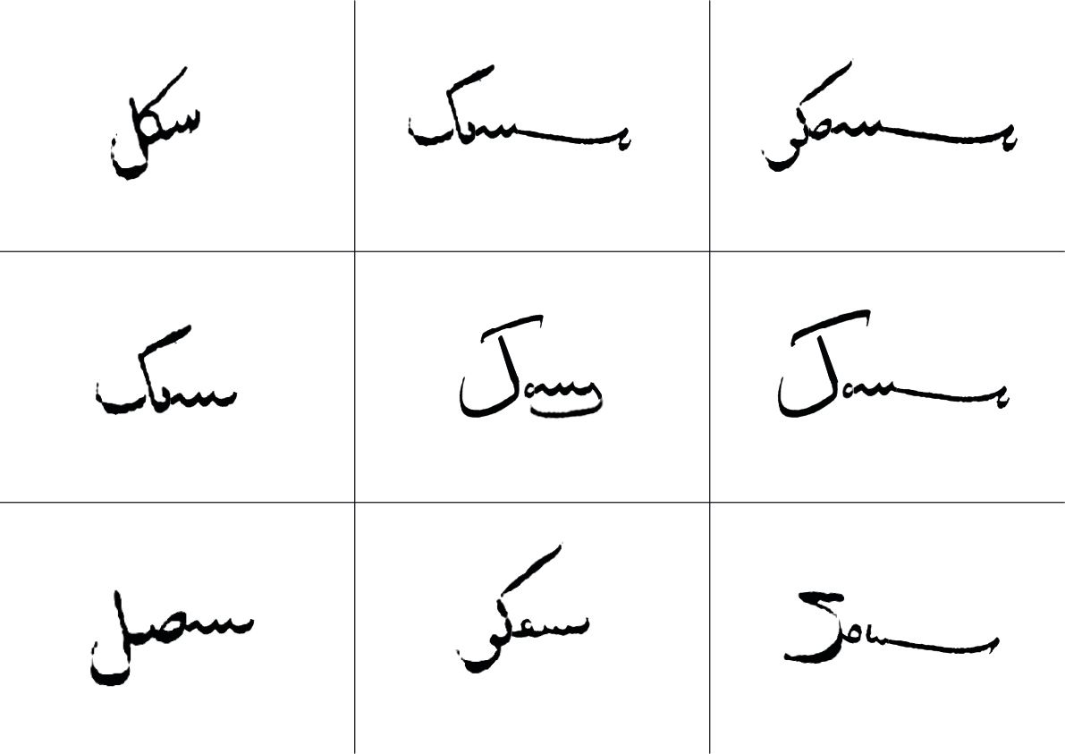
Here are some of the printed samples of the Straits hand, written by Abdullah bin Abdul Kadir, an author, scribe, and printer in the 19th century, that Darryl shared with PT.
Straits hand has a few distinctive notes. The calligraphy has a diagonal angle and a left-leaning slant to its calligraphic style.
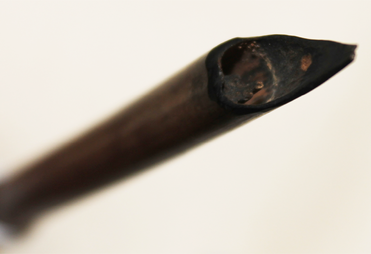
The script has what palaeographers and calligraphers would call a ‘monolinear hand’. This refers to the written letters that have a consistent thickness in their written strokes.
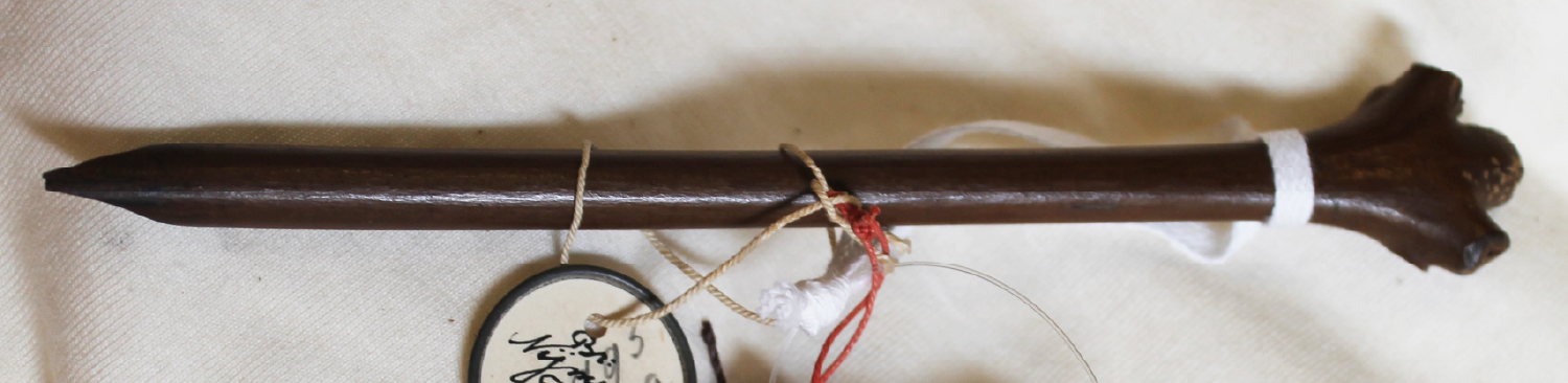
The Straits hand’s monolinear character is a product of the writing instrument of the time, the reed pen, which was often cut with a pointed nib. Western calligraphy’s modulated stroke, similarly, is a product of the pens and quills that were used.
(Aside: the extent to which available writing materials affected the evolution of scripts is a fascinating area of research. Some scholars, for example, believe that the use of palm leaves influenced the shape of the rounded Burmese script. Rounded writing, as opposed to more angular, was apparently less likely to damage the surface and split the leaf.)
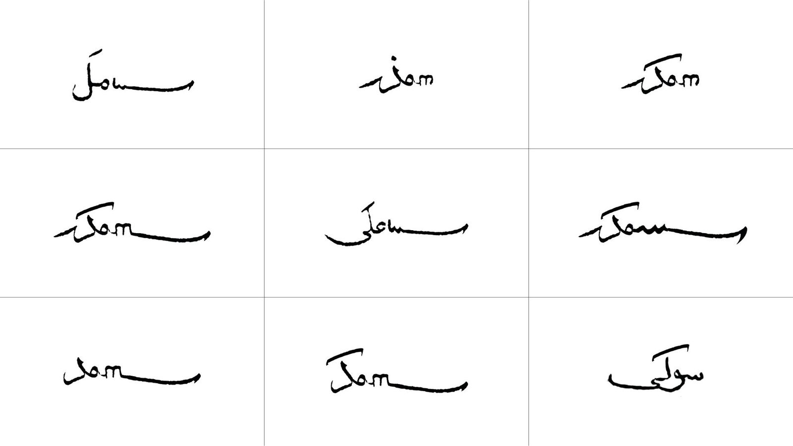
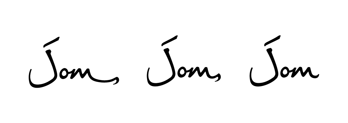
PT started experimenting with the script to write the word jom. The designers tried to incorporate as many elements of Straits hand as possible. There was a natural tension between being faithful to the Jawi script and legibility for a reader of a Latin script. Too much Jawi influence, in other words, might render jom difficult to read.
The stroke is called a ‘kashida’. It is used in Jawi (and other Arabic-derived forms) for various functional and stylistic purposes. It can be used as justification for multiple lines of text. It allows for a horizontal elongation between letters in a word. It’s often an embellishment that modulates pacing. It can also be used to end letters that end with a terminal stroke as we have adapted in an iteration of Jom further below.
We whittled down the options to these three.
The above decision was probably one of the toughest we’ve had to make. Many of us like the symbolism of the terminal stroke and comma. For some there is an energy to it, for others, including PT, it is in keeping with our ethos of slow journalism.
Unfortunately, we still ran into legibility issues with the terminal stroke. Some read the first one as Jome or Jomi, and the second one as Joms.
Yes, we could have dedicated resources towards educating the market—”It’s Jom!”—but ultimately we felt that it might be too much of a stretch.
That’s the process that led to the logo that you see.
Finally, an unexpectedly cool addition from this Jawi journey is our symbol.

Jawi allows for letters to be stacked on top of each other, so the symbol above actually reads Jom.
“It is a seal, or cap mohor,” says Faris Joraimi, Jom’s history editor. “It has a potent history in Malay letter-writing, as a stand-in for the sender, giving the document authority but also a kind of talismanic life.”
According to Faris, this borrows from Indo-Persian scribal traditions. “Ottoman and Mughal documents also had elaborate seals.”
You’ll notice that we occasionally use this symbol, for instance in some of our social media posts. We all love it, and can envision many potential uses for it, including on the spine of books, if Jom ever decides to enter that market.
And that is the story of how our publication name, Jom, came to be written in a Jawi-influenced script. We like the temporal dialogue inherent in this choice—a traditional script for a very contemporary, fun, Malay word.
If you enjoy Jom’s work, do get a paid subscription today to support independent journalism in Singapore.
